Wayte Binding
Marrying heritage craft
with cutting-edge
Wayte Binding
Marrying heritage craft
with cutting-edge
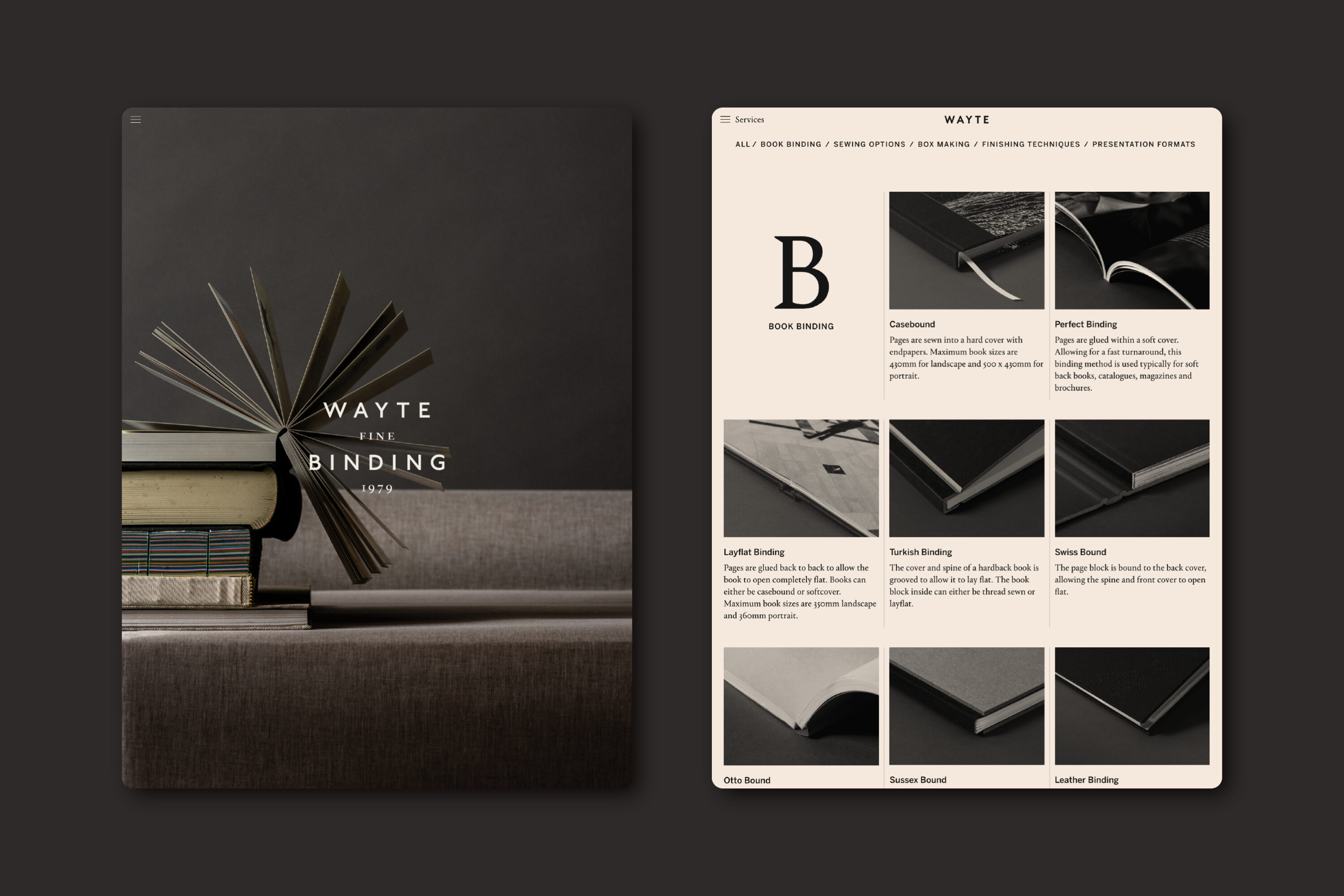
Wayte is a second-generation, family-run company that specialises in a comprehensive range of book-binding, box-making, and print-finishing services.
Our identity refresh focuses on establishing Wayte as a business relevant in the 21st century while retaining the value of its long heritage.
The logotype is inspired by the time-honoured typesetting form of book title pages, and an accompanying symbol references traditional printers’ marks.
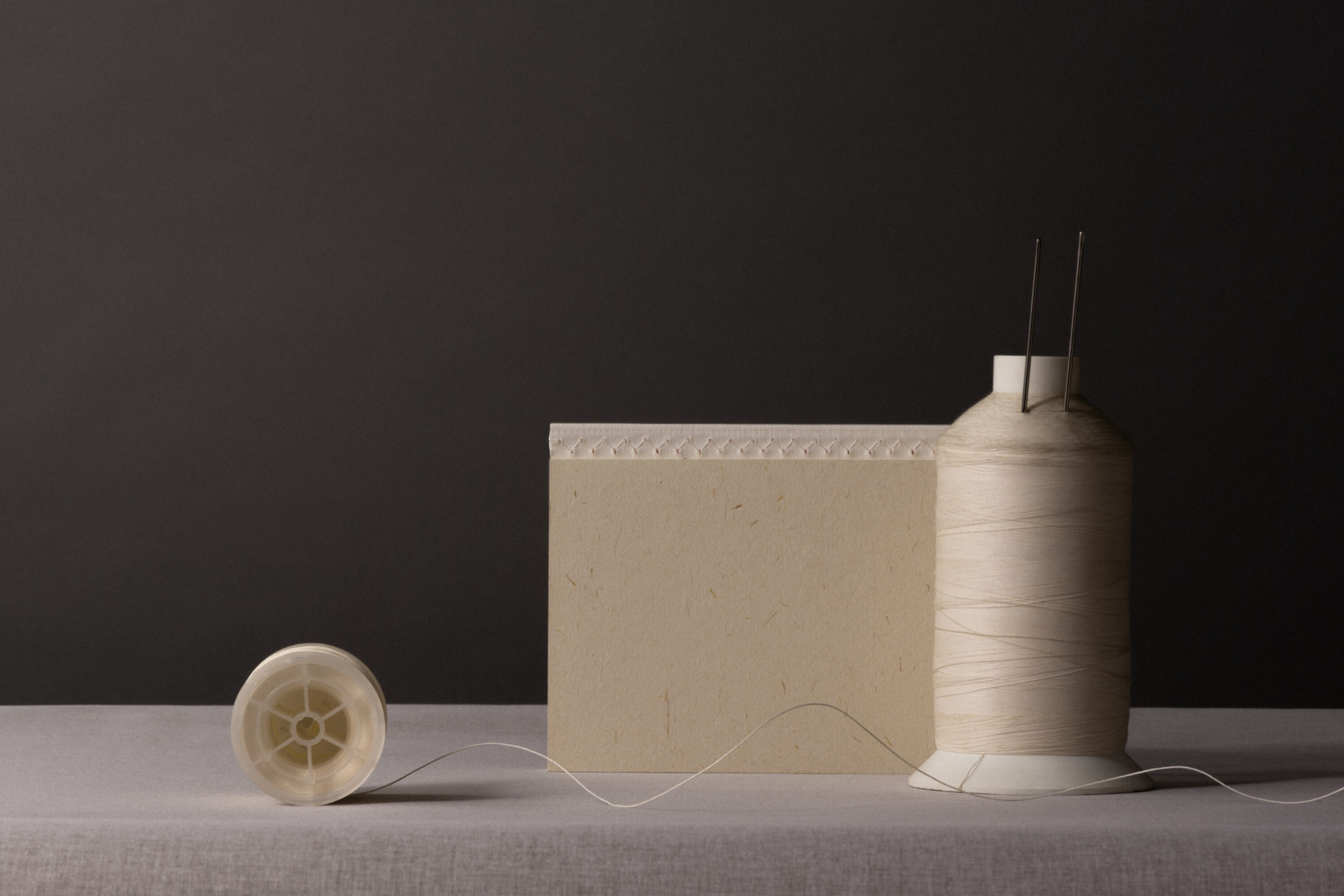
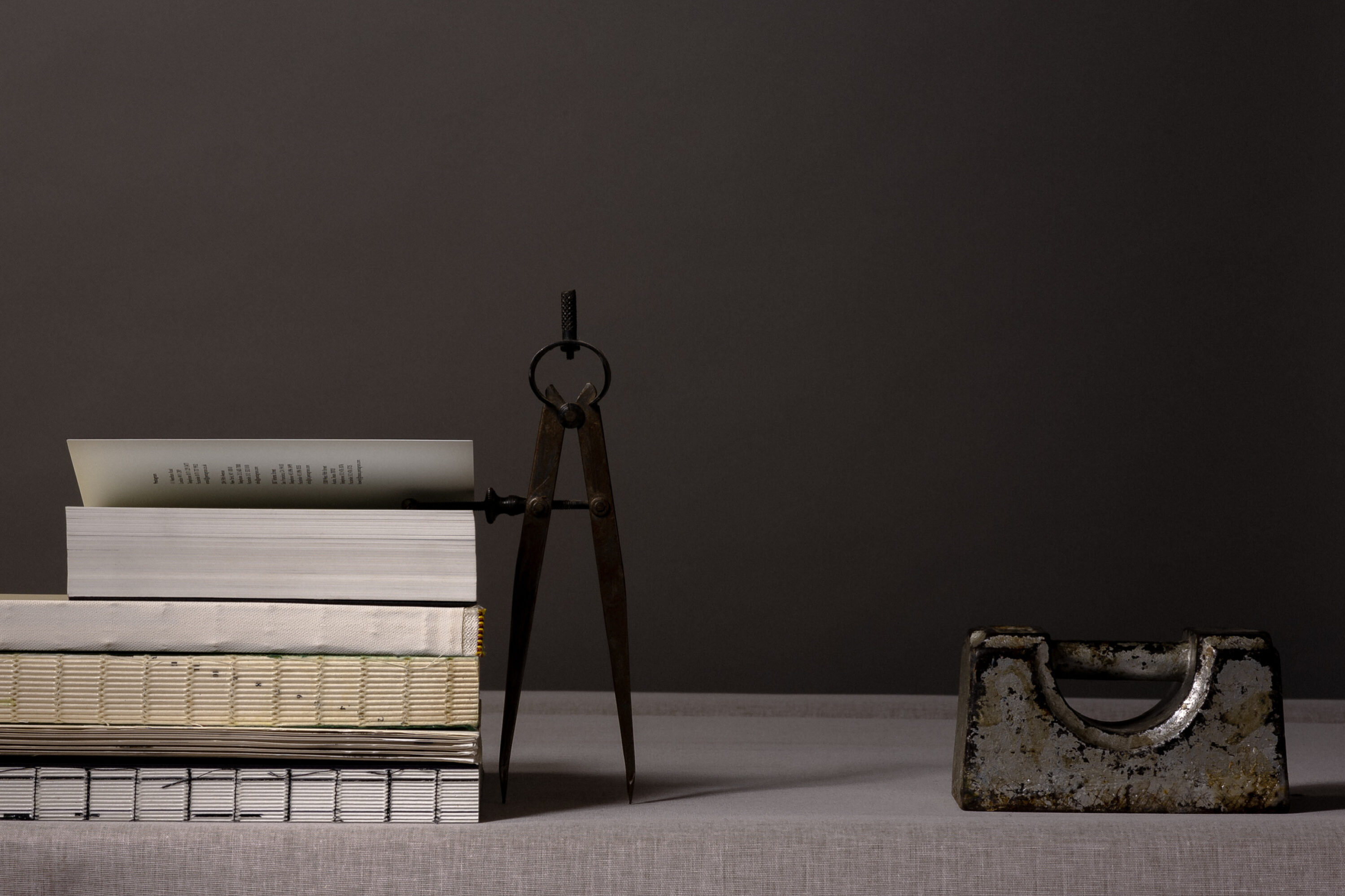
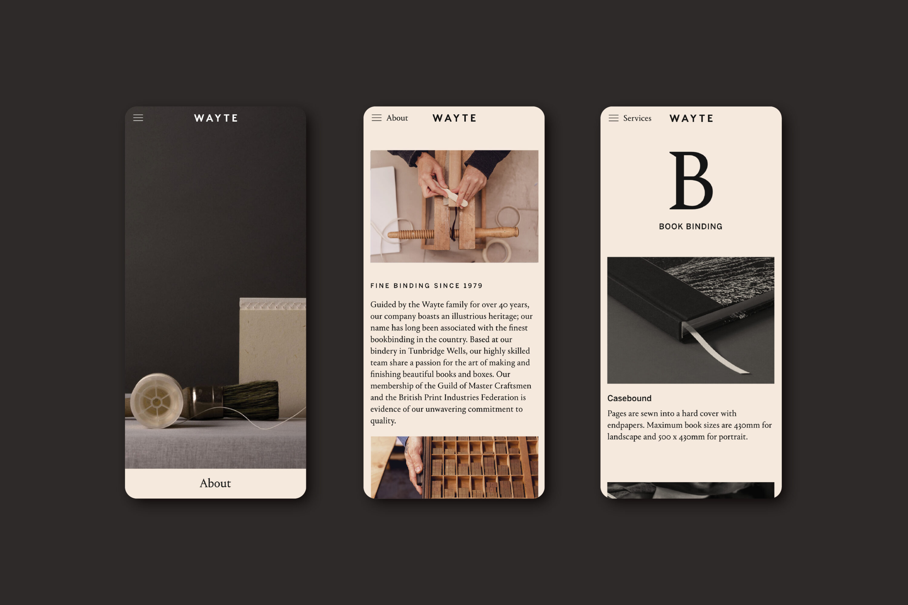
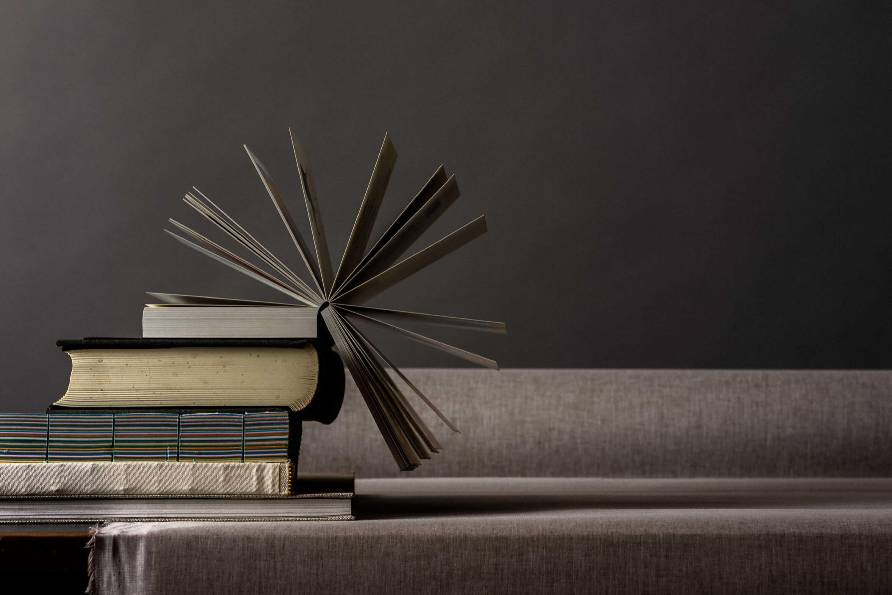
With its warm palette and textural richness, the imagery suite celebrates the tactile nature of the art and the beauty of binding methods. The playful compositions of book-binding tools allude to the company’s forward-looking mindset and openness to experimentation.
Scope
Brand Identity
Art direction
Website design & build
Photography
Ruth Ward
Writing
Regard
