SGS
Echoing the qualities of an interiors aesthetic
SGS
Echoing the qualities of an interiors aesthetic
SGS is an interior design studio specialising in classic, high-end residential and selected commercial projects.
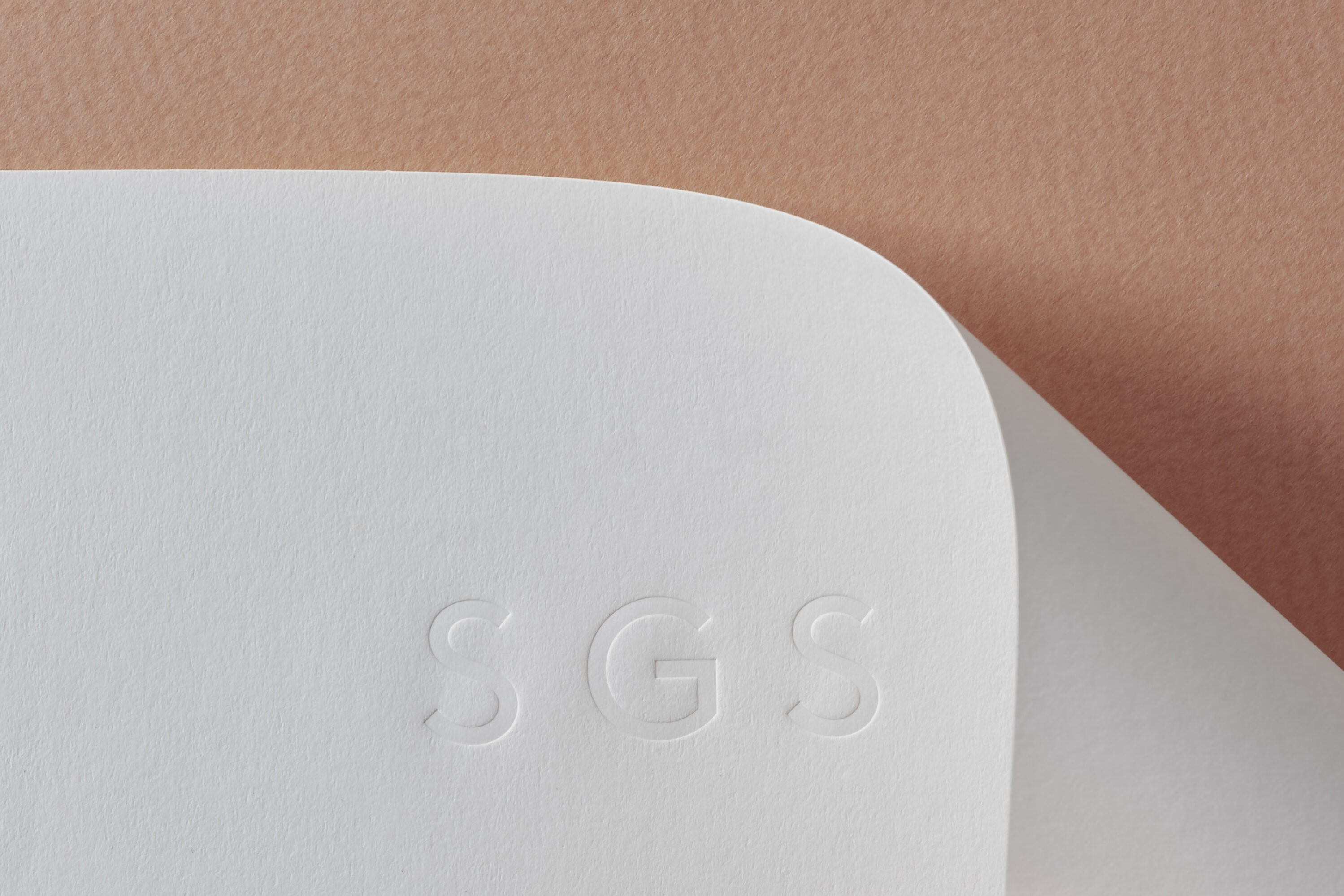
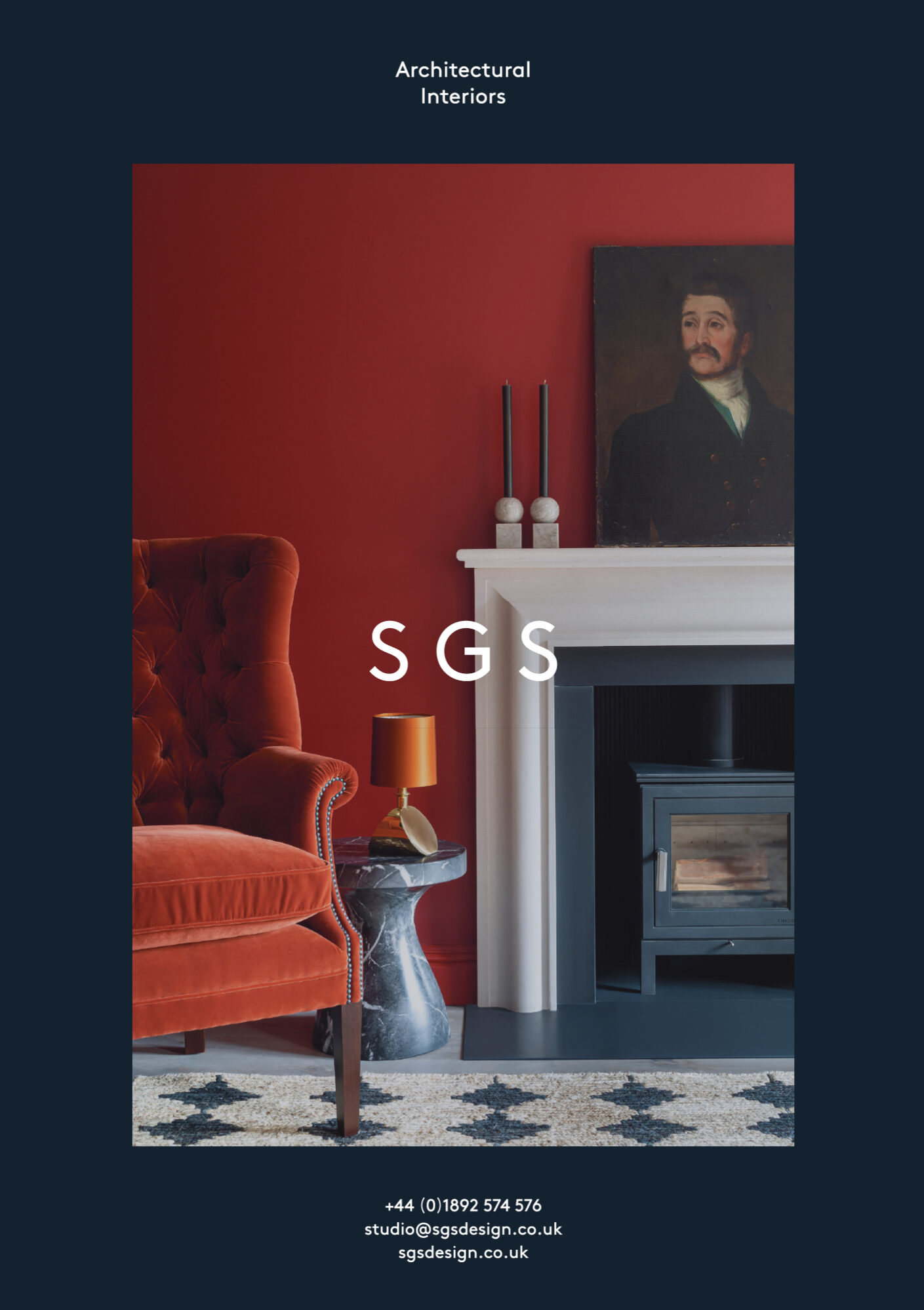
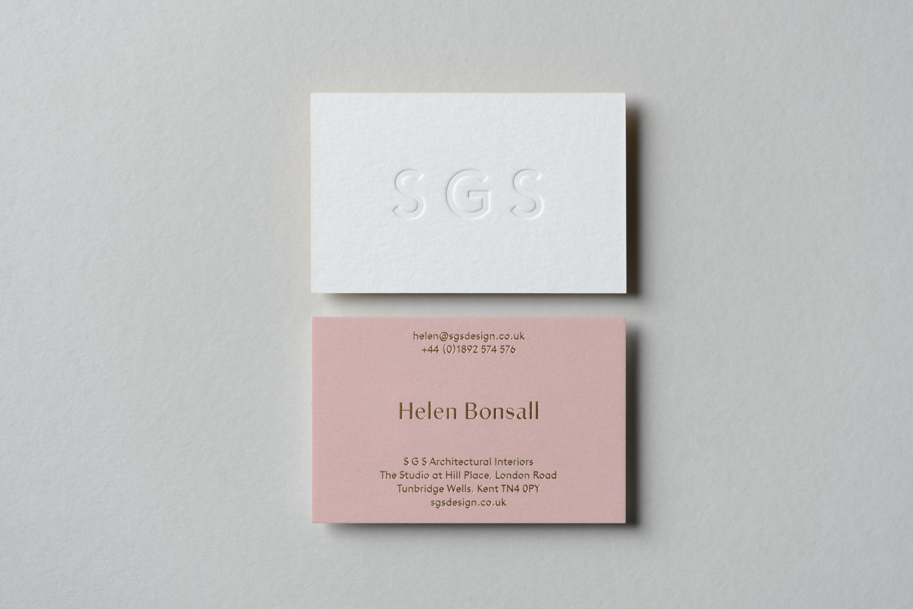
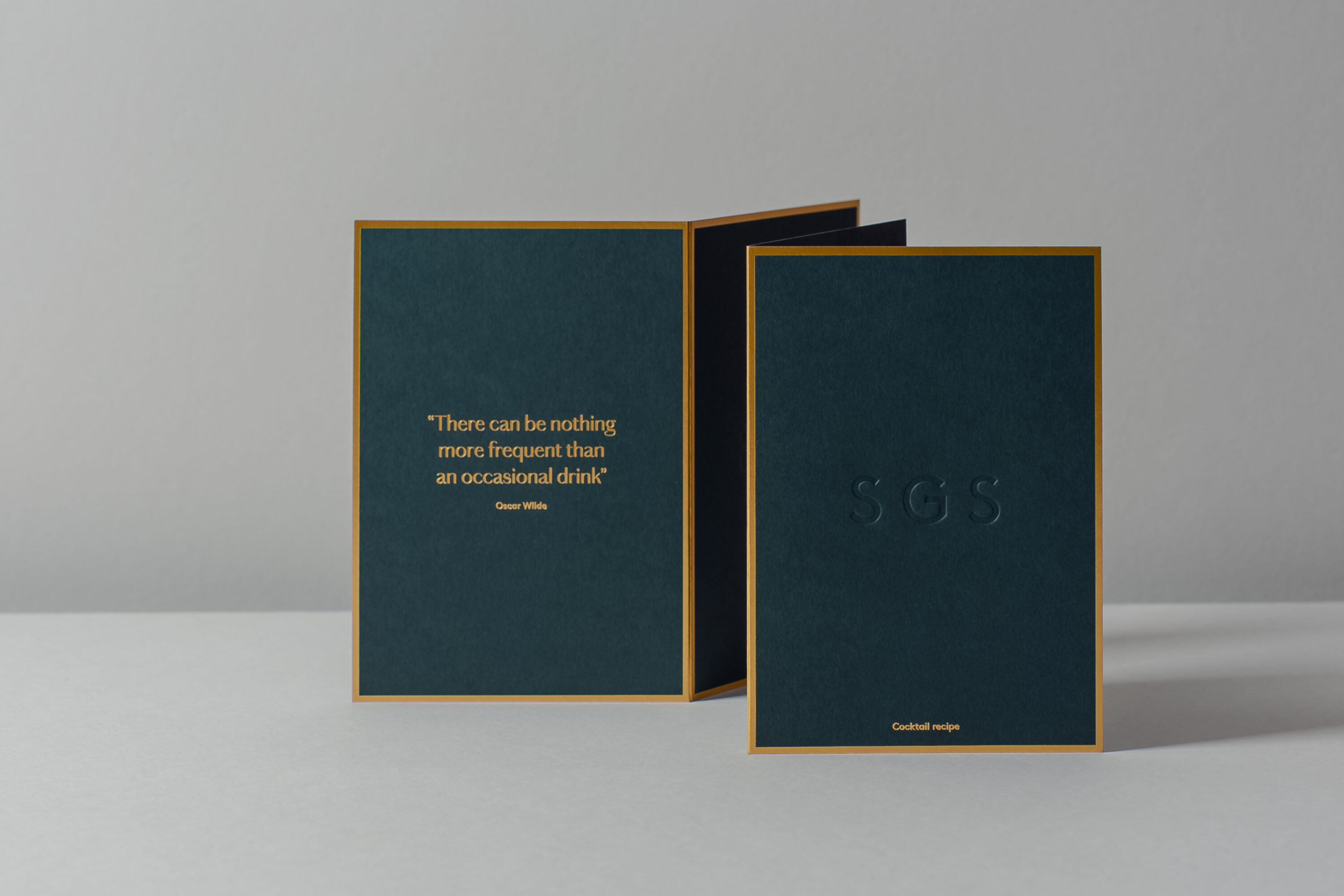
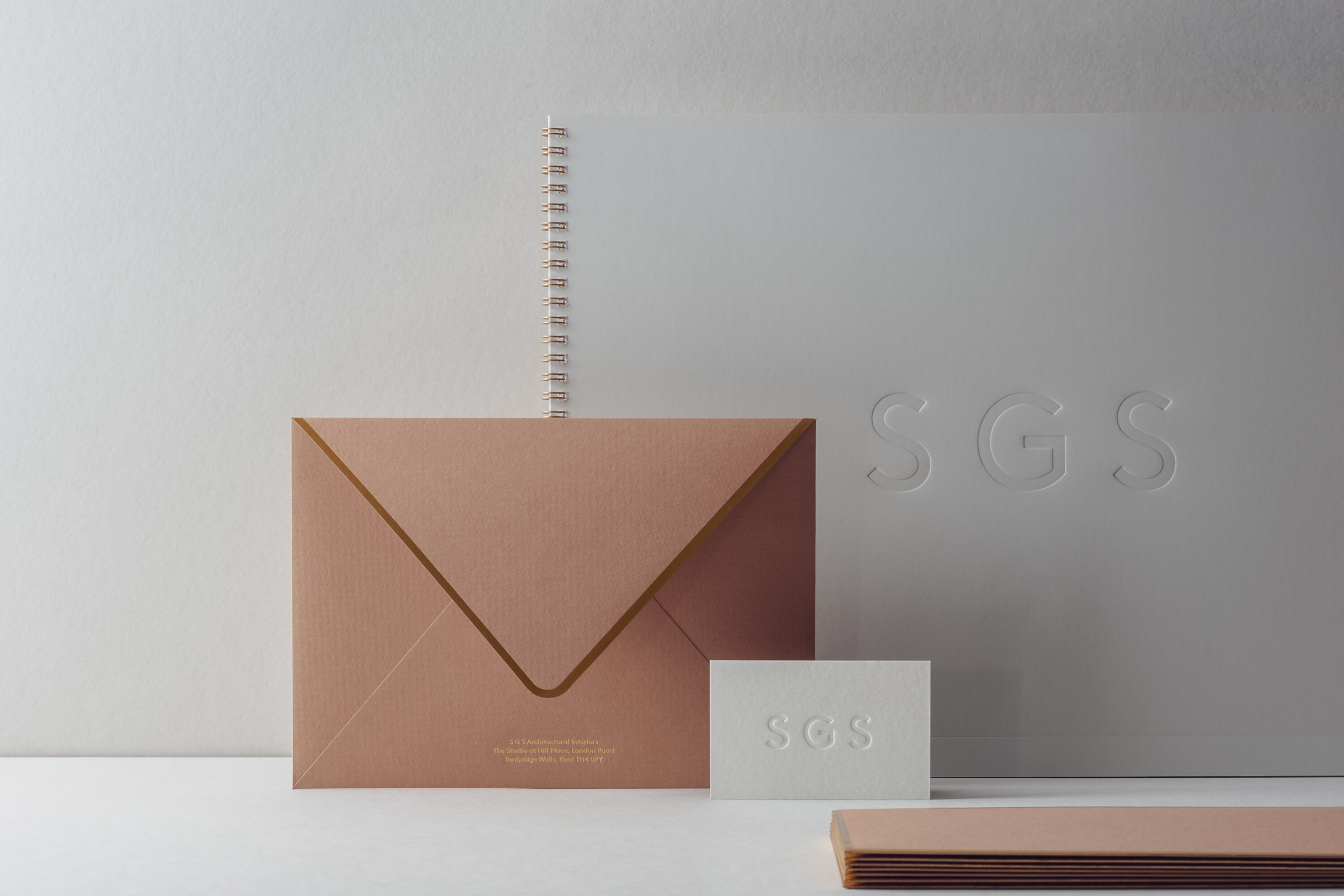
Our visual identity echoes the studio’s distinctive sensitive approach to combining material, texture and colour. The custom logotype is paired with a supporting serif typeface – Chiswick Serif by Paul Barnes – inspired by eighteenth-century British lettering. It’s a sympathetic contrast that expresses the balance between clean architectural forms and warm living spaces. The colour family is inspired by materials and finishes used in key projects, while the stationery and marketing materials feature tactile materials, finishes and accents, including bronze metallic foils.
Scope
Brand identity
Website design & build
Print
Marketing
Photography
Ruth Ward
