M&S
Reuniting a brand
with its provenance
M&S
Reuniting a brand
with its provenance
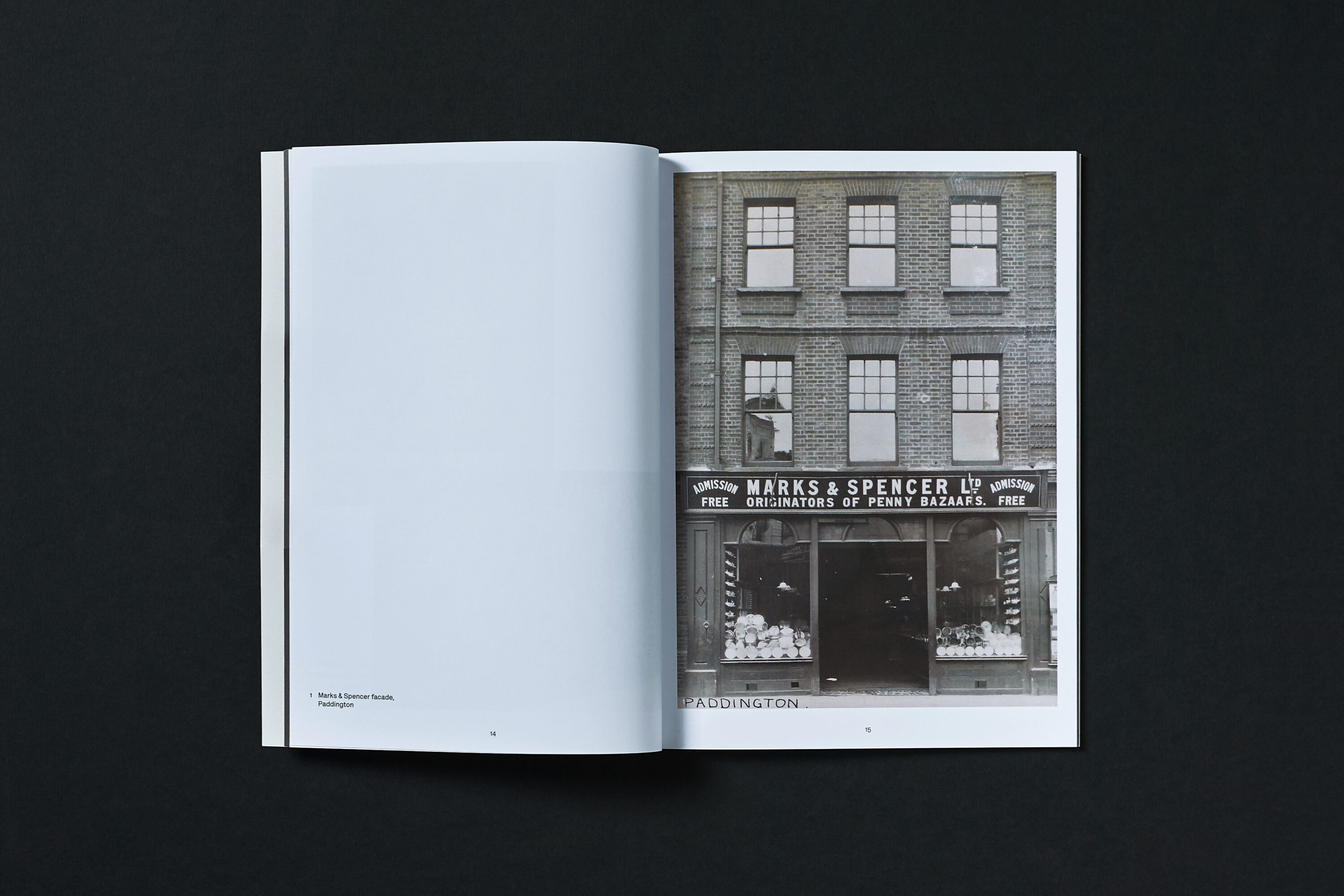
Marks & Spencer has held a special place in Britain’s retail landscape and hearts since 1884. However, in an increasingly cluttered and competitive retail landscape, consumers’ perceptions of the brand had become confused.
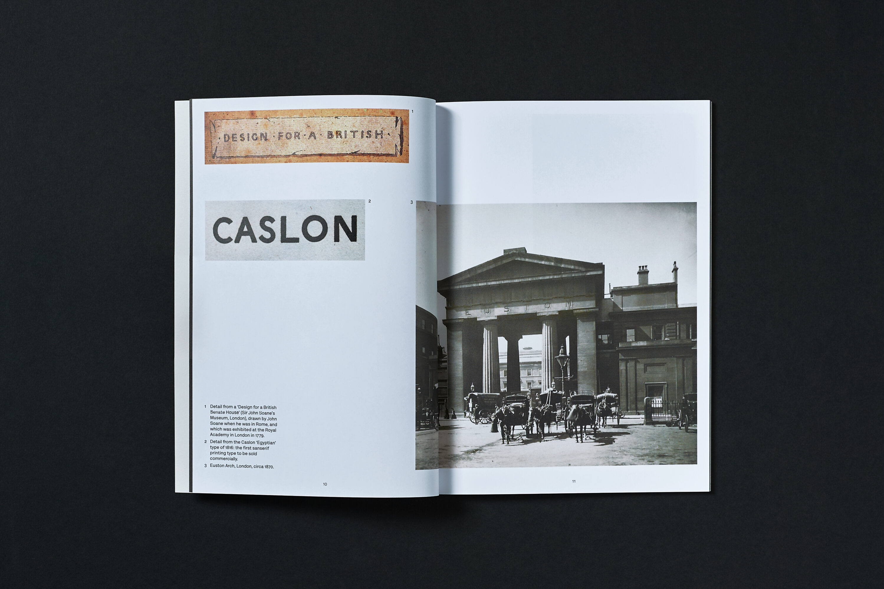
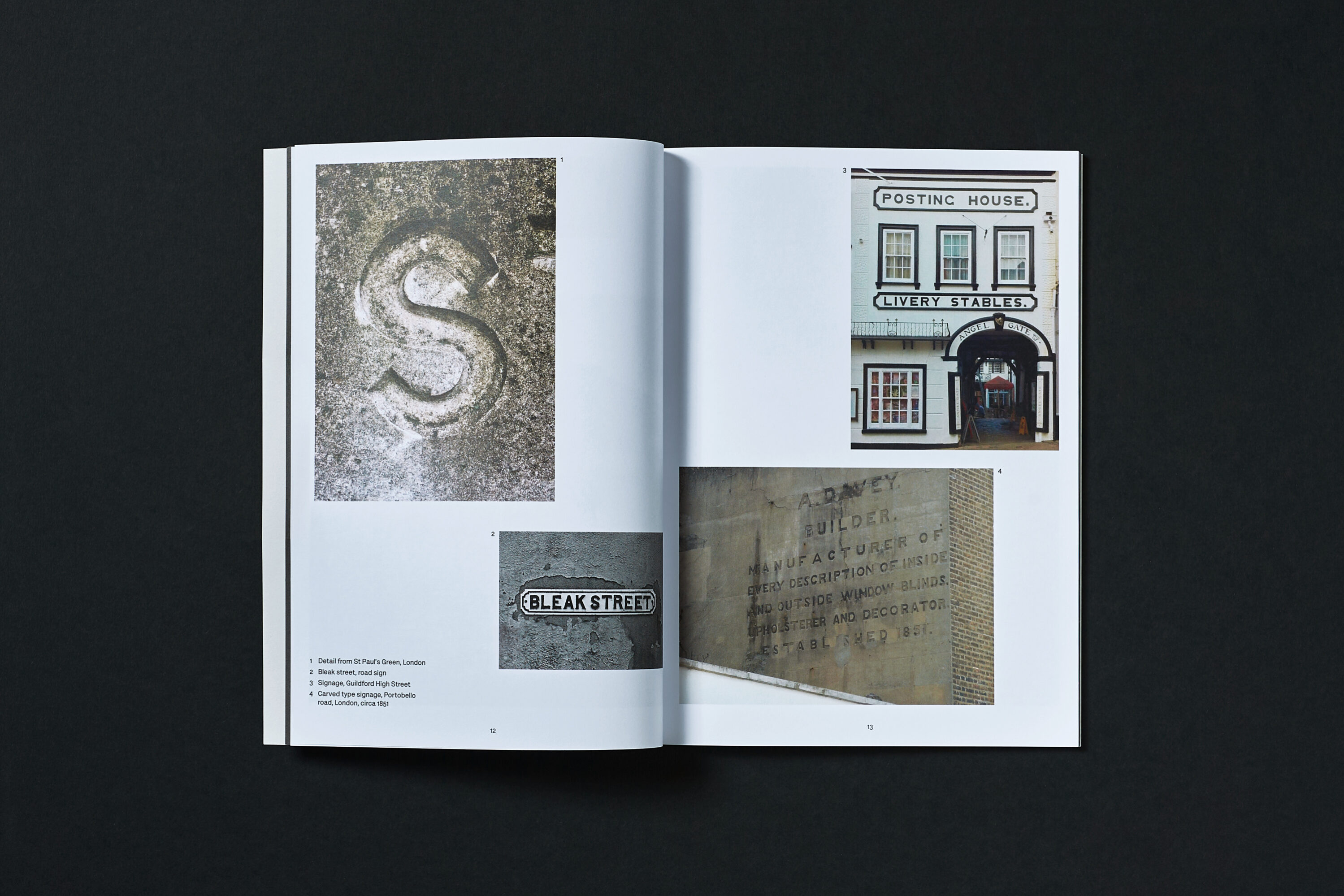
We were appointed as one of a team of external agencies to consult on a new visual identity system to clarify and visually reinvigorate the brand. The collaborative creative solution was to reference Marks & Spencer’s rich heritage through a contemporary lens – to carefully reference the brand’s provenance while establishing a thoroughly modern visual language. With our creative support, the design solution moved towards a celebration of the British vernacular across newly created brand assets, including a recrafted logo, a refined colour palette, a custom grotesque typeface, and store fascia treatments.
Scope
Visual strategy


