Falcon Enamelware
Redefining an icon of British homeware
Falcon Enamelware
Redefining an icon of British homeware
Falcon Enamelware has been an instantly recognisable icon of British home life since the 1920s. In 2011, the original collection was revitalised with an expanded range featuring new products and colourways.
The launch of the new collection demanded an identity that sensitively honoured the brand’s heritage while repositioning it for a broader, contemporary audience. The core essence of Functional Elegance was at the heart of all expressions of the new identity.
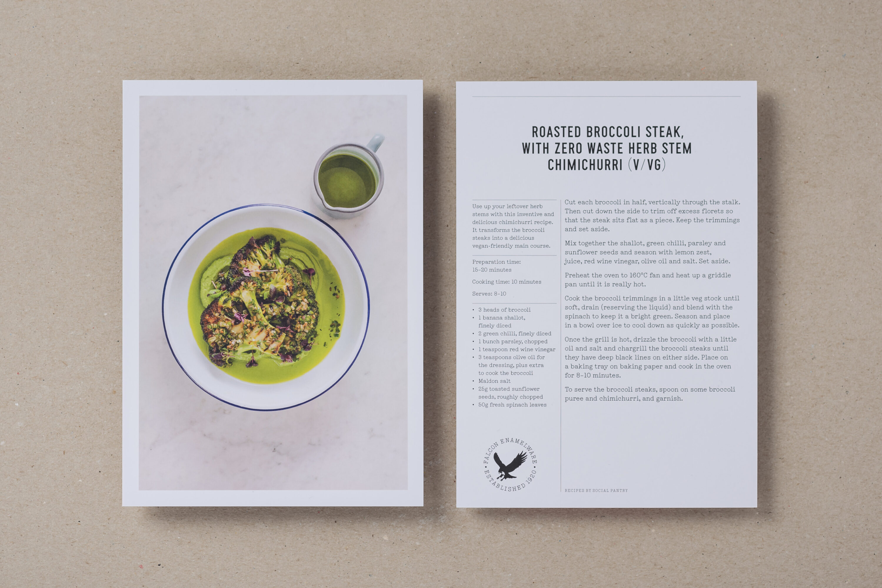
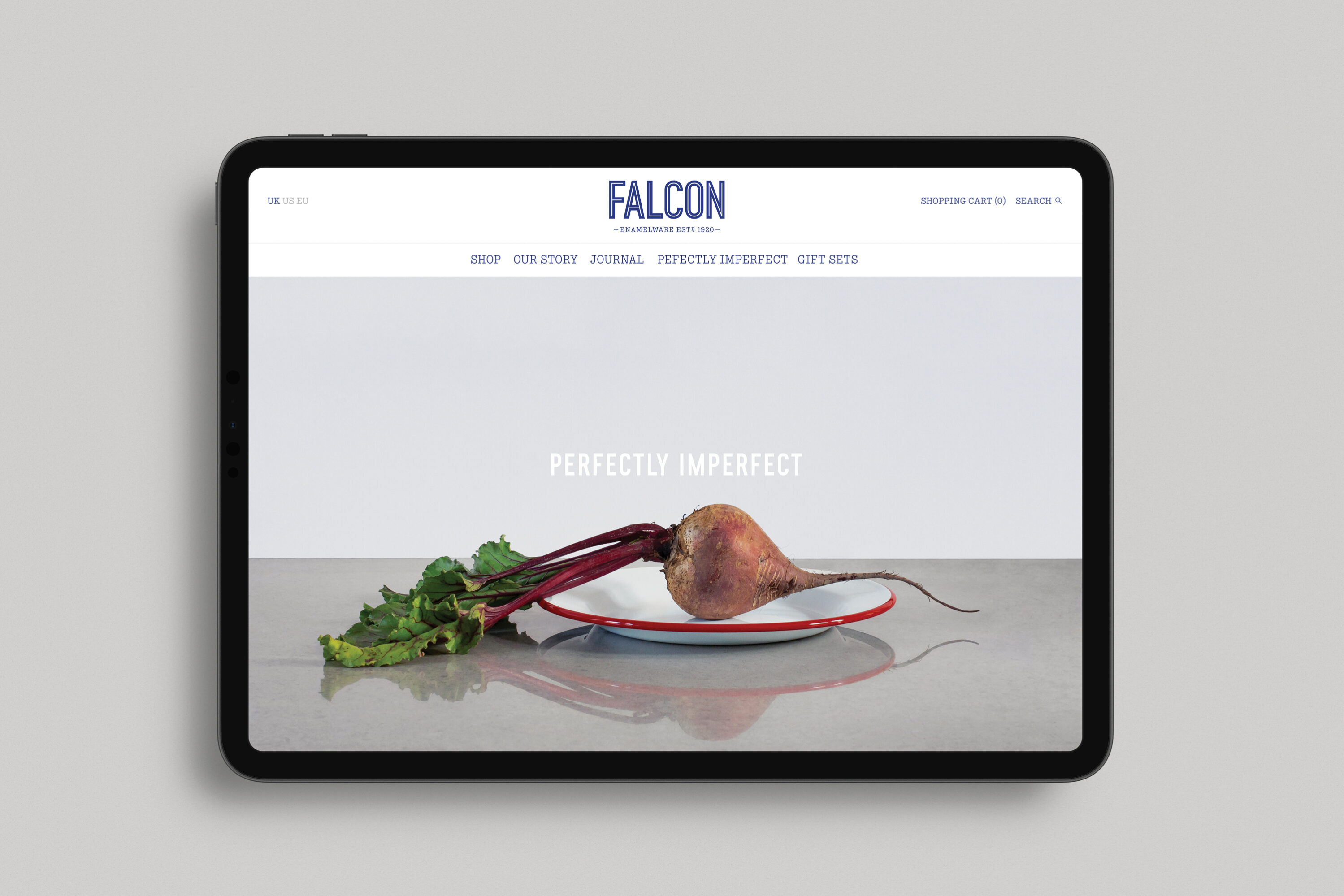
The visual identity forges an emotional connection with consumers by leveraging the familiarity of the product’s iconic blue rim. Both the logotype and the bespoke inline typeface reference the rim viewed from above, an approach that also informs photography and packaging illustrations.
Product photography features food narratives that embrace the unpolished honesty of cooking. The packaging is purposefully unfussy and utilitarian, featuring a halftone image of the product screen-printed in two colours on rugged corrugated cardboard. The redrawn ‘falcon in flight’ crest is the hallmark of authenticity on each product. The identity extends across packaging, art direction, and the brand’s e-commerce website.
Scope
Brand identity
Typeface design
Packaging
Print
Art direction
Website design
Photography
Ruth Ward
Joff Lee
Sam Stowell
Typeface production
Universal Thirst